

Silk Milk Redesign
Gwen Riemer and Claire Goetzke
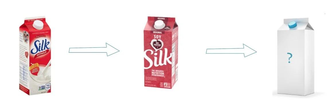
Objective: Redesign Silk Soy Milk packaging
Silk’s current website
Their website has an earthy and simple style that is not reflected in their product’s packaging

Design Goals
Add Personality: Earthy, Adventurous and Progressive
Compete with other new alternative milk
Appeal to new market
New Target Market
Young
enjoys plant based food
cares about the environment
“When I lay out the pros and cons for cow milk and plant based milk, it’s more about environmental reasons, and it’s a plus that there’s no lactose.”

Ideation
After some research on the origins of the company, it was found that it started in Boulder, Colorado. The iconic mountains and nature is something their new target market would definitely be into, so we decided to incorporate that into our designs.
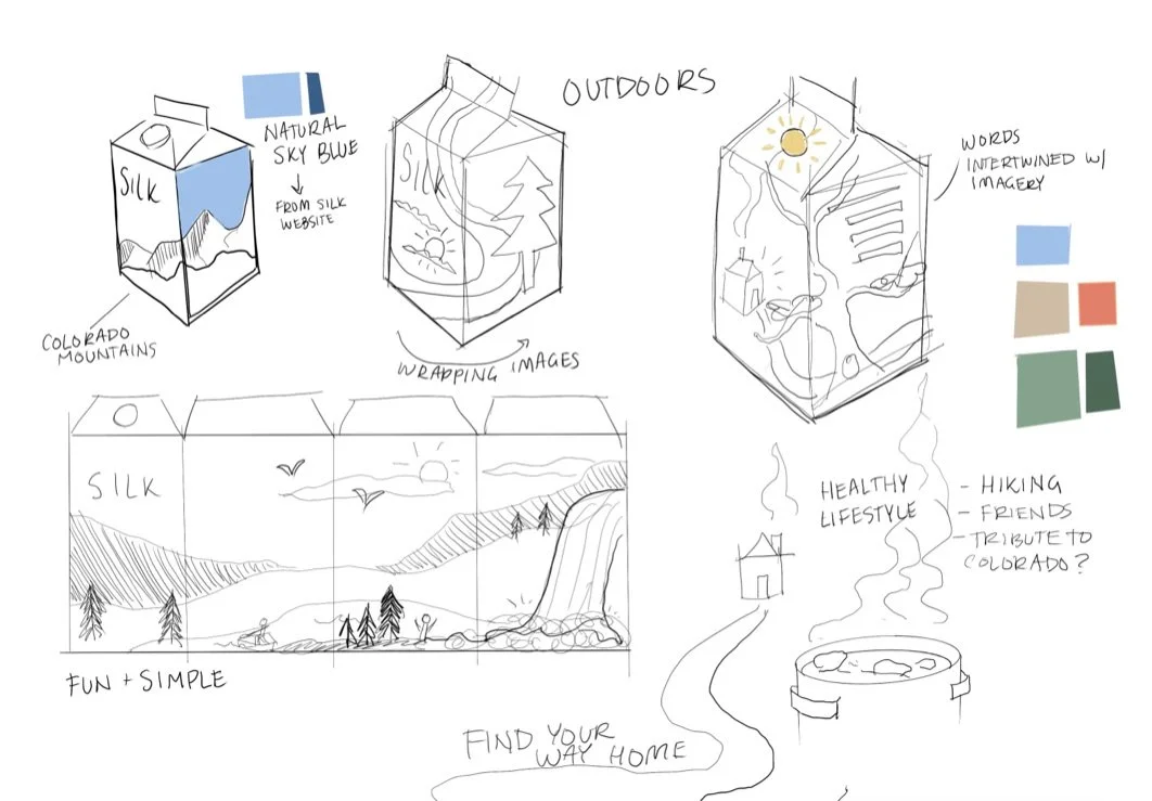

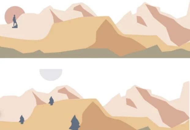


This little piece of land that the consumer could watch change over the course of a day. Three very different colors.
Highlighted tag-lines that already existed as part of their brand. Everything on the carton was already part of their brand, just highlighted in the way it deserves.

